Growing the Experience Library from side of desk to the foundation of Co‑op’s digital experience
Seven years leading the community before it got a team. A pivot that helped spread user-centred design across the business. The shared foundation for Co-op’s digital estate, with over £1.5m in documented savings.
The business
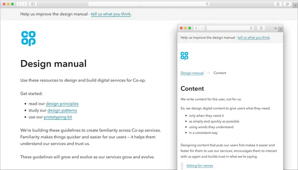
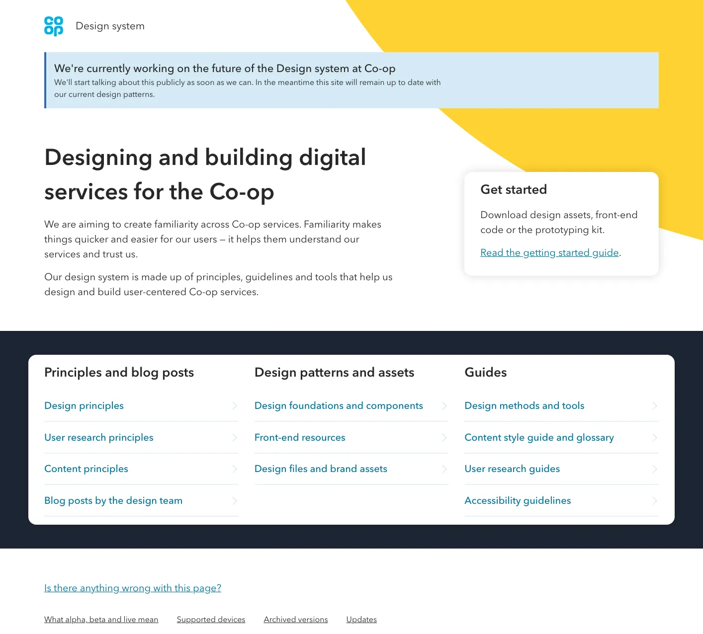
When I walked into Co-op 12 years ago a design system wasn't understood as a valuable user-experience asset. So I built one, for the small team that existed then, mostly so we could prototype in code and test our assumptions. I championed it, sold it, kept it alive and brought others on the journey. Now it's the foundation of every digital journey (and many non digital) within the Co-op customer experience.
What we've come away with is not only solutions to our specific problems. But as a team, we have a clearer understanding of the design principles and a deeper appreciation of the discipline.
My role
- Founded it and wrote the original codebase and guidelines.
- Ran it as a product: vision, roadmap, contribution model, and the business case that funded it.
- Ran the Experience Foundations team that created the Co-op Experience Library
- Picked it up when funding ran out and kept momentum through community effort
The problem
There was never a mandate to implement a design system and as a Lead Designer in a traditional, hierarchical business I had to convince a lot of important people that this was the right way to do things.
The Co-op businesses were very separated, controlled their own budgets and had their own agencies to design and build their products.
Constraints
- No mandate and no budget for seven years. Everything had to be earned and proven.
- Businesses that needed to sound different. The way you speak to a customer in a food store is not how you speak to a customer in a funeral home.
- Contributors with day jobs. Anything we asked had to fit around real delivery pressure.
- Voluntary adoption. No authority to enforce anything.
Key decisions that shaped it
Using a re-brand as a key moment
In 2016 Co-op re-branded to the 'Clover leaf' logo. It was a brilliant move that would help connect customers back to the iconic brand they remembered.
What I received was a PDF and design decisions that had been made without a designer or accessibility expert in the room. I had colours that weren't accessible, website layouts that broke usability rules, all sold in at the highest levels.
The job became selling in my interpretation of the re-brand. One that would work for everyone. Accessibility was the lever I used. Co-op was an organisation set up to help the poorest in society, by extension it is an organisation that everyone should be able to interact with.
I created the new system, collected the evidence, and sold the new system into the group board.
Familiarity over consistency
Co-op’s businesses need to communicate in ways appropriate to each of them, so its services are always going to feel somewhat different. That's fine, as long as they feel familiar.
The system had to feel familiar, not multi-brand. A customer needs to trust Co-op across a food store, a funeral home and an insurance quote, without those three experiences being identical.
Building the business case before asking for the team
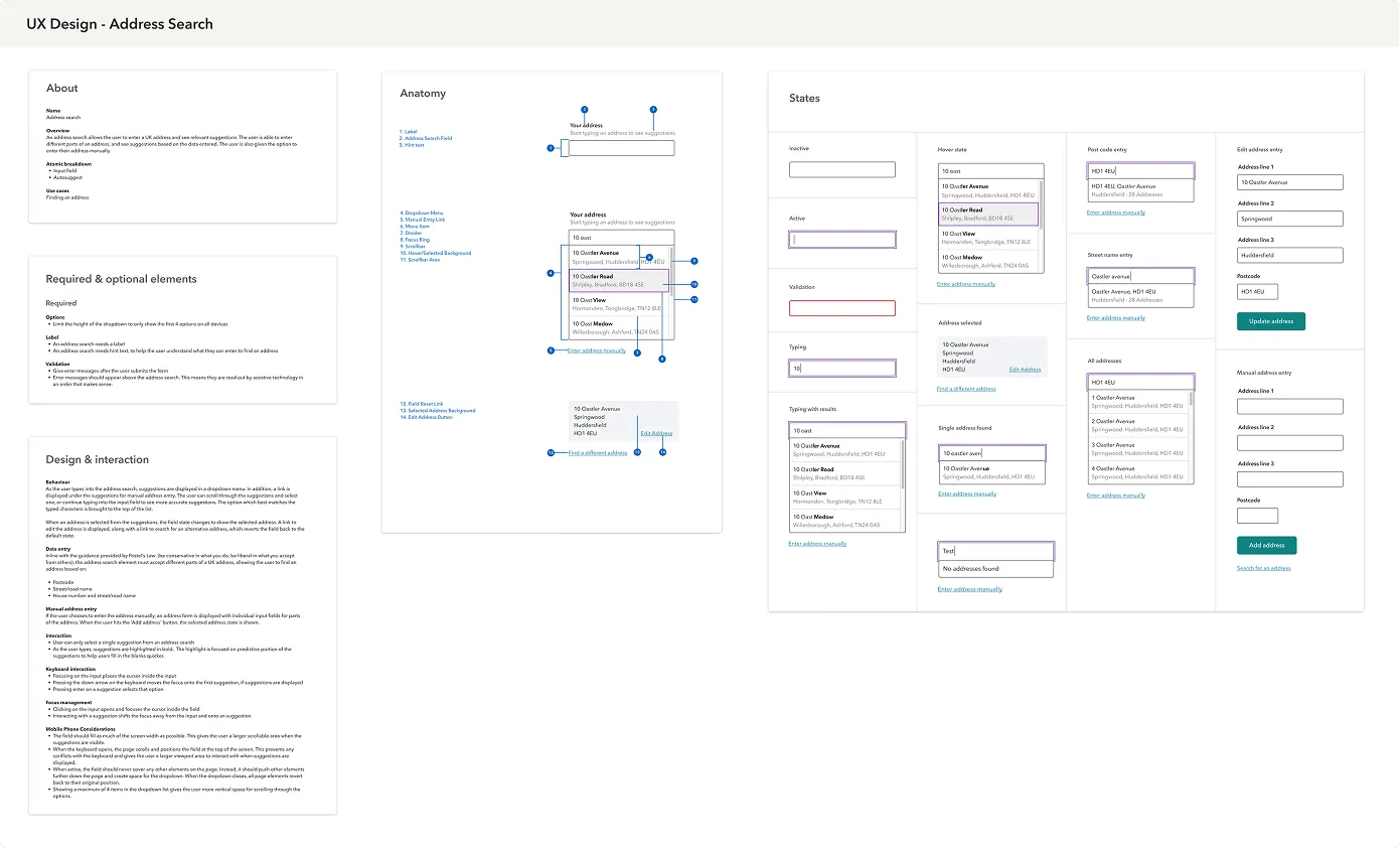
As Principal Designer I took on the re-platform of all the Co-op websites. This was the moment I proved the real value of a design system, by fully embedding its foundations in the deliverable, customisable, but to the design standards.
I did the sums on savings and set them alongside the accessibility and brand benefits. In September 2020, after seven years, we had a dedicated team.
By combining time to discover, design, build and test components across multiple websites we calculated at that point we'd saved the Co-op £1.5m, without ever having an official design system team.
What we got wrong, and how we changed course
Research helped uncover the real needs when funding for engineers was removed
The Design Foundations team almost immediately stalled. We'd researched and designed a lot of components common to the user journeys, but almost immediately engineers had to work on more critical products.
We went back to our research, found areas to explore and quickly found there were many unmet needs that a group of designers could meet.
In many organisations lots of people design. That could be content design, procurement for systems that need to work for people or actual user interface design. All of it can affect a customer's experience, and people are trying to make things better for them. A poster in store, a stretched logo on a display TV. All these things we could help with.
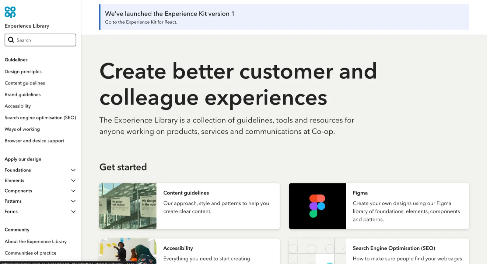
Creating the Experience Library
As we built out content that could help this new audience we realised we had to create something new, something that everyone in Co-op could use without feeling alienated.
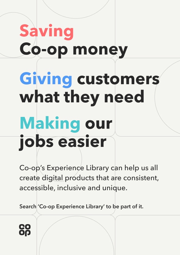
That's when I used a brand sprint to help us come up with a new direction and a new name, the 'Experience Library'. A design system for everyone.
Supporting patterns we did not agree with
We weren't there to look over anyone’s shoulder or be the police. When a team had a pattern that worked for them and we would have done it differently, we supported it anyway.
We found that by supporting, people were more likely to ask us why, or for help. The moment a design system becomes enforcement, teams find a way around it and you lose the visibility that makes the whole thing work. Being helpful and supportive got us more adoption than being right.
What we did
We stopped being a design system team and started being a design enabling team.
- Broadened the content guidelines beyond online journeys, and in doing so opened the library to everyone who communicates on behalf of Co-op.
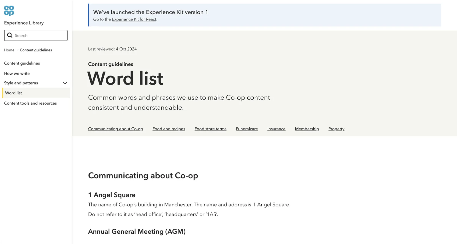
- Worked with comms people across business areas to build a word list, so Co-op used the same language whoever was writing.
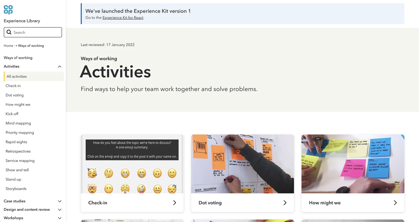
- Added ways of working: methods, activities and techniques, developed with the Digital Skills team who run masterclasses for teams outside digital disciplines. Teams finished a masterclass and had somewhere to go to keep using what they had learned.
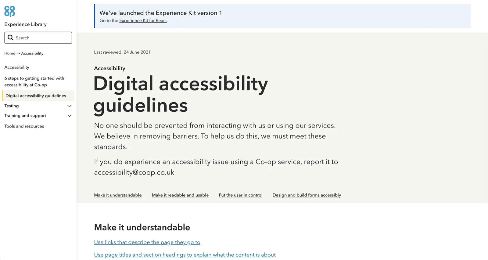
- Made accessibility as accessible as we could, with standards written for people who had never read the WCAG guidelines.
- Established content processes so anything added was researched, critiqued, understandable, accessible and we worked with subject matter experts across Co-op to check the guidance.
- Created a visual language intended to make people experiment and build on the foundations rather than just comply with them.
What I took from it
Building support and trust is what enables contribution. Not tooling, not governance, not documentation quality. If people do not trust that you are on their side, they will not bring you their problems, and a system nobody brings problems to stops being a system and becomes an archive.
Support is the key to contribution. A busy team gets support on detailed components and interaction and a ready to use, evidence based solution. We get a pattern other teams can pick up. The contribution model turned demand into supply.
The reason it has lasted is that it stopped being mine. I made sure it was part of everyone's objectives, but it's the passion for doing the right thing for real people is what carried it through.
Outcomes
- Over £1.5m in documented savings to delivery teams.
- A funded, enduring team capability, from a project that spent seven years with no mandate and no budget.
- The shared foundation for Co-op’s digital estate. All Co-op websites are built the same way.
- Opened to everyone at Co-op in November 2021, covering content, ways of working, accessibility, components and patterns, search engine optimisation and brand guidelines.
- Widely used and referenced, and owned by many people. Part of the culture rather than a team’s asset, and it has outlasted every version of the team that built it.
- Industry recognition for rethinking how design scales across an organisation.